If you’re an avid reader, you’ve probably read enough to know when a book cover is right on the money
or when it’s not. I think indie authors
find a hard time trying to get the right cover for their books, something that
gives an image of the main characters and whatever elements are relevant to the
story. Or, in some cases, they don't use the characters at all. Believe me, I’ve struggled with my own covers. We are always searching for the “right cover”. Well, that right cover can be elusive.
If you’re a writer, you know what I mean. You have a specific image in your mind of the
characters, how they appear to you in your consciousness. If you’re a really good writer, you can
picture a lot of things – not only the characters, but the scene as it’s
playing in your head. And we want to
bring that to the page as well as we can.
So, sometimes I play around with images. It is exciting to find a picture that is
close to your character, or as close as possible. You’ve heard of storyboarding, right? This is like character boarding. Don’t laugh, but I just came up with
that. LOL. Okay, you can laugh. Sometimes I collect a collage of close images
to characters or scenes. It can be great
fun, and can help writers get a better feel for their characters. We all know when something isn’t quite right
or doesn’t match up to our characters.
This can also give readers a better sense of how the character should
look too. And if the cover artist is a whiz
in his or her profession, that is helpful, right?
So, how do you picture your characters as a writer? Do you really see them in your head? Do you go find a similar picture online
somewhere and think, “Yeah, that’s the protagonist exactly”? Could you take it further and describe your
villains or scenes in a set of images?
Well, why not? It might be a fun
exercise.
And readers, do you usually find that book covers represent
the characters pretty well? With books I
have read, either it does or doesn’t, but I try not to let that affect my
pleasure in reading the story. It is,
however, pretty interesting to see how closely those characters can be
matched.
I’d really like to know your thoughts on this. But, in the meantime, I’m going to post some
pictures of my characters and scenes for your own enjoyment.
UPON YOUR RETURN (historical romance)
Characters: Fara Bellamont and Grant Hill
My suggestions to the cover artist:
The Cover
LEATHER AND LACE (romantic suspense)
Character: Evangeline Lewis
My ideas:
The Cover:
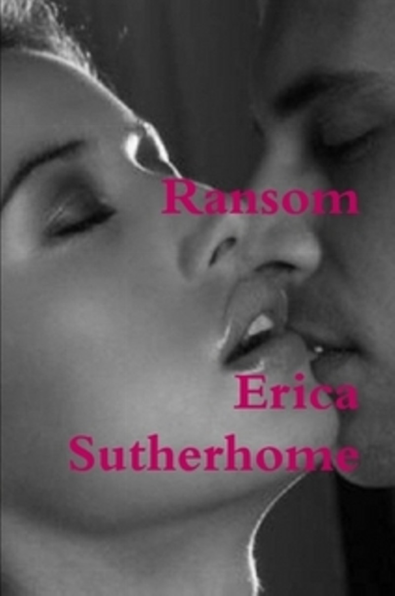
RANSOM (romantic suspense)
Characters: Lance Redding and Triana Richards
My ideas:
The Cover:
A TOUCH OF DAWN (contemporary romance)
Scene: couple at sunset in Oregon
My ideas:
The Cover:
PERFECT GAME (contemporary romance)
Scene: Kenya
My ideas:
The Cover:
A MISPLACED LIFE (mystery/thriller, paranormal)
Character: Alexa Hamilton
Scene: a pier, water
My ideas:
The Cover:
PURSUIT (romantic suspense)
character: Susannah Peters
My ideas:
The Cover:
HAUNTED (romantic suspense)
character: Carmen Martinez
The Cover:
TERROR IN THE NIGHT (thriller, paranormal, romantic suspense)
Scene: eerie forest
My ideas:
The Cover:
STRANGE HEAT (contemporary romance)
Characters: Victoria Weston and Richard Jacobs
My ideas:
The Cover:
WITHOUT YOU (contemporary romance)
Characters: Jenna Stoneson and Reece Carson
Theme: Drama, Theater
My ideas:


The Cover:
A HINT OF SCANDAL (mystery/romantic suspense)
Characters: Payton Jones and Bruce Johnson
My ideas:
The Cover:
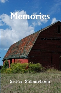
MEMORIES (contemporary romance)
Character: Sadie Johnston
Scene: horse ranch, farm
My ideas:

The Cover:
HARD TO GET (romantic mystery)
Character: Gwen Donovan
Theme: police procedural
The Cover:
SOULFUL RAMBLINGS AND OTHER WORLDLY THINGS (literary fiction/poetry)
Theme: Paranormal, Mystical
My ideas:
The Cover:
RAMBLINGS, MUSINGS AND OTHER THINGS (literary fiction/poetry)
Theme: Nature
My ideas:
The Cover:
EXPRESS CAFE AND OTHER RAMBLINGS (literary fiction/poetry)
Scene: café, cat
My ideas:


The Cover:
UNPUBLISHED BOOKS:
Magick & Moonlight (paranormal romance)
(status: under contract, should be published soon)
Characters: Jessie Anderson and Ethan Hamilton
My suggestions to the cover artist:
Stay tuned for the cover...
Upon Your Honor (historical romance) - the sequel to UPON YOUR RETURN
(status: editing for submission)
Characters: Chloe Waverly and Gabriel Hill
My ideas:


I was very happy with the way my book cover came out. It absolutely represents what I had in mind. However, that is because I hired a photographer and we picked out the model and some of the accessories. My photographer did the photo digital editing to create the special effects. The only way it doesn't represent what I had in mind is in that I was thinking about having a wolf in the photo with her. Unfortunately, we couldn't find an image of a wolf at the correct angle to look natural. Plus the additional editing would have pushed us over budget.
ReplyDeleteClick here for the image. http://lilojabernathy.blogspot.com/p/illustri.html
That looks great, Lilo! :)
DeleteAs I'm writing my regencies I tend to build my characters throughout the book so at the end I've got a complete image in my mind what they look like. Occasionally I've got an idea before the book is finished and will present them to my cover artist, as in the case of The Masked Lady and The Murder.
ReplyDeleteNice cover, Lindsay!
DeleteThe problem with images of characters is that they won't correspond to every reader's idea of how they should look. I have steered clear of photographic images for that reason and tried more for atmosphere.
ReplyDeleteI agree. Sometimes covers don't match up with the description in the book. I have a paranormal romance coming out soon, and I had to fight my cover artist about how the characters are actually supposed to look. Eventually, we both settled on something, but it was hard finding the right cover.
DeleteI like this article and it certainly fits with what happened to us. We had a good friend create our bookcover based on a summary and some descriptions of the characters. We gave him an idea for one cover and he came back with five 'proofs' for us to pick from. The funny thing was that he actually drew the climax of the book without realizing it, so we decided to go with that one. He did a great job and we love our cover so much. But I think it helps to have a cover artist that doesn't know the story by heart, because they can step in with a clear image and come up with something we as authors didn't even think of because we have the story and characters memorized so well. I love the covers you have and I think they worked out amazingly well.
ReplyDeleteThanks, Jessica!
ReplyDelete